How to Show Discounts at Shopify Checkout (Strike-Through Pricing)
Checkout is the last moment to reassure shoppers. Learn how a stronger Shopify checkout discount display can make savings clearer and reduce hesitation.
Your customer is at checkout. Their finger hovers over the “Place Order” button. The payment form is filled out. They are one click away from completing the purchase. This is exactly where a strong Shopify checkout discount display can make the difference between hesitation and confidence.
Then doubt creeps in.
Is this still a good deal? Are they overpaying? They added the items an hour ago and scrolled through a dozen product pages in between, they no longer remember the original prices, they just see a total: $247.80.
Somewhere in the order summary, there may be a discount line. But if savings are not clearly attached to each item, the value feels abstract instead of reassuring.
Now imagine the customer sees this instead:
- Item 1 (was $89, now $67) – Save $22
- Item 2 (was $98, now $78) – Save $20
- Item 3 (was $120, now $90) – Save $30
- Total savings: $72
Suddenly, doubt turns into relief. The purchase feels smart. The deal feels real. They click “Place Order.”
Checkout is the moment of truth. A visible discount at this stage can be the difference between a completed order and an abandoned cart.
Why Shopify Checkout Discount Display Matters
A better Shopify checkout discount display matters because checkout is where price anxiety peaks. Customers are no longer casually browsing. They are making a final decision with real money on the line. If the discount is not obvious at this point, the order can feel more expensive than it actually is.
This is why checkout visibility matters so much. Customers may have been convinced earlier on the product page or in the cart, but at checkout they need reassurance again. A visible savings message reminds them that they are still getting a good deal.
When a shopper sees “You’re saving $72 on this order,” it directly reduces hesitation. It reframes the total, reinforces value, and makes the decision feel safer.
You can see a related issue in this guide on why Shopify discounts do not show until checkout. If savings only become clear at the very end, many merchants lose momentum they already earned earlier in the funnel.
Shopify’s Native Checkout Discount Display (And the Gap)
In a standard Shopify checkout, the order summary typically shows:
- Product line items
- A discount line with the total discount amount
- Subtotal
- Shipping
- Taxes
- Final total
The discount is technically there, but it is often condensed into a single line. Customers may see full prices on products, then one combined discount below. That means the savings are present, but not especially persuasive.
The problem is simple: a single discount line does not reinforce the value of each item. It does not show what the customer is saving product by product. It does not make the deal feel vivid.
That creates a gap between “discount applied” and “discount clearly understood.”
If you want the customer to feel confident all the way through checkout, you need more than a technical discount. You need discount visibility.
For earlier-stage visibility, this guide on how to show discounted prices on Shopify product pages is a useful companion to this article.
Shopify Checkout Discount Display: What Adsgun Adds
Adsgun closes that visibility gap by making discount information clearer at checkout.
Instead of relying on one compressed discount line, Adsgun helps present savings in a way that feels immediate and easy to understand. That gives shoppers more confidence right before payment.
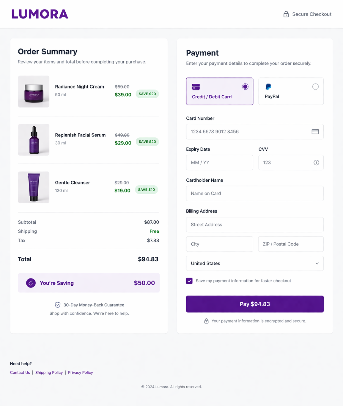
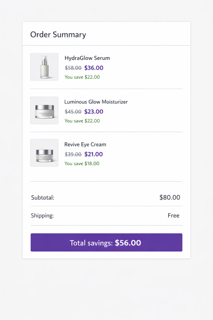
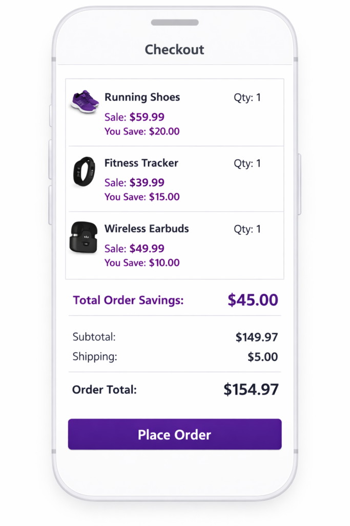
1. Per-Product Original and Sale Price
Each item can show the original price alongside the discounted price. This makes the savings visible at the line-item level instead of hiding everything inside a single order-level discount.
Example:
- Running Shoes: Was $79.99, now $59.99
- Fitness Tracker: Was $54.99, now $39.99
- Wireless Earbuds: Was $59.99, now $49.99
This format is much easier to process than showing only a total discount somewhere lower in the summary.
2. Per-Product Savings Message
Customers can also see how much they save on each item.
Example:
- You save $20
- You save $15
- You save $10
This makes the deal feel more tangible. Instead of one abstract discount, the order feels full of individual wins.
3. Total Order Savings Highlight
At the bottom of the order summary, total savings can be called out more clearly.
Example:
Total savings: $45.00
That kind of message reinforces value right before the customer submits payment.
4. Optional Percentage-Based Savings
Some stores may also want to show percentage savings for extra clarity.
Example:
You’re saving $45.00, or 23% on this order
For some audiences, the dollar amount lands better. For others, the percentage makes the deal feel stronger. The right format depends on your store, your average order value, and how your promotions are structured.
The Psychology Behind a Better Shopify Checkout Discount Display
Visible savings work because they reduce uncertainty at the exact moment when uncertainty tends to rise.
Here is what happens psychologically:
- Anchoring:
When the original price is visible, the discounted price feels more valuable. The shopper compares the new price against the old one and sees a clear gain. - Loss aversion:
When customers clearly see what they are saving, abandoning the purchase can feel like losing that savings opportunity. - Decision reinforcement:
A shopper who already clicked through product pages and added items to cart wants confirmation that the choice still makes sense. Visible savings provide that confirmation.
This is one reason why stores often perform better when discounts are visible across the full journey, not only at the final payment step. If you also want to strengthen discount visibility in the cart, this post on showing discounted prices in the Shopify cart is worth linking into the cluster.
Real-World Example: Why Full Discount Visibility Lifts Conversion
When customers see discounts only once, they can forget about them. When they see discounts throughout the journey, the message sticks.
That is why the strongest setup is usually:
- Product page visibility
- Collection page visibility
- Cart visibility
- Checkout visibility
By the time the customer reaches checkout, they are not trying to remember whether the deal exists. They are simply confirming it.
This is also why checkout discount visibility works best when it is part of a broader conversion strategy, not a one-off design tweak. If you want a wider playbook, see how to push sales on Shopify.
How to Set Up Shopify Checkout Discount Display with Adsgun
If you want a stronger Shopify checkout discount display, the setup should be straightforward and focused on clarity.
Shopify Checkout Discount Display with Adsgun: Step by Step
Step 1: Install Adsgun
Install Adsgun from the Shopify App Store.
Step 2: Create or select a promotion
Inside Adsgun, create a new promotion or open an existing one.
Step 3: Choose the discount setup
Select the Shopify discount or promotion rules you want to display.
Step 5: Choose how savings appear
- strike-through pricing
- a savings amount
- a savings percentage
- a total order savings message
Step 6: Customize the appearance
Adjust visual settings so the savings message feels clear and on-brand.
- Typical choices include:
- sale price color
- savings badge styling
- font size
- total savings message wording
Step 7: Preview on desktop and mobile
Make sure the discount display is readable, balanced, and not cluttered.
Step 8: Publish and test
Run through checkout yourself and confirm that customers can clearly see the discount before payment.
If you want background reading on Shopify’s native discount behavior, Shopify’s own documentation on discount codes is a useful external reference.
Discount Visibility Works Best Across the Full Funnel
Checkout visibility is powerful, but it performs best when it is part of a consistent experience.
Here is the ideal structure:
| Stage | What the Customer Should See |
|---|---|
| Product page | Original price, discounted price, strike-through pricing |
| Collection page | Sale badges or visible promotion indicators |
| Cart | Per-item savings and total savings |
| Checkout | Per-item savings, original vs. sale price, total order savings |
The goal is simple: do not make customers re-calculate the deal in their heads.
Make the deal visible at every important step.
Shopify Checkout Discount Display on Mobile
Mobile checkout is even more sensitive to hesitation because the screen is smaller and attention is shorter.
A good Shopify checkout discount display on mobile should do three things well:
- show the discounted price clearly
- keep savings visible without clutter
- preserve readability inside a compact order summary
If the shopper has to expand sections, squint at tiny text, or mentally compare prices, the experience becomes weaker. Mobile discount visibility should feel immediate and effortless.
This is where a clean visual hierarchy matters most. The customer should instantly understand the original price, the sale price, and the total amount saved.
Ready to Reassure Customers at the Moment of Truth?
Checkout is where deals are won or lost. A customer hovering over the “Place Order” button is vulnerable to second thoughts. But when savings are visible, those second thoughts are much easier to overcome.
A stronger Shopify checkout discount display helps customers understand the value of their order right before payment. That means less hesitation, clearer pricing, and more confidence at the final step.
Shopify’s default checkout does not always make savings feel obvious. Adsgun helps make them visible.
Start your free 7-day trial and enable checkout discount display today. No credit card required.